
左邊為“長”字,右邊為“圓”字與“88“的結合。
(圖像上,為二片餅乾的結合,又可在外為結合一個8字)
利用長字的延伸,捧著右手邊的圓字,代表二者相互依靠的本質。
長字底下菱形圖,是早期銅錢的穿洞,藉此隱喻:將長圓的業績串起,一路長紅。
四平八穩的設計,期望為長圓帶來穩定的成長,日復一日,慢慢茁壯。
本案為換掉客戶沿用多年的LOGO,為公司新氣象注入全新的視覺。
與各位分享。
This LOGO is from Chinese word "長圓" and "88".
The vision is including "2 pieces of cookies and 88 with coins".
In Taiwan, "88" means: "fortune", and in this company, "88" still means their product's softness.
This case is for changing customer's logo used for many years and bringing fresh icon image.
業主:長圓食品有限公司
Customer: Chang-Yuan Food Co., Ltd.

新LOGO與舊LOGO的差異
What different between these 2 LOGOS!
I try to use English to introduce my art work.
Maybe, my English is not good enough, but I try it.
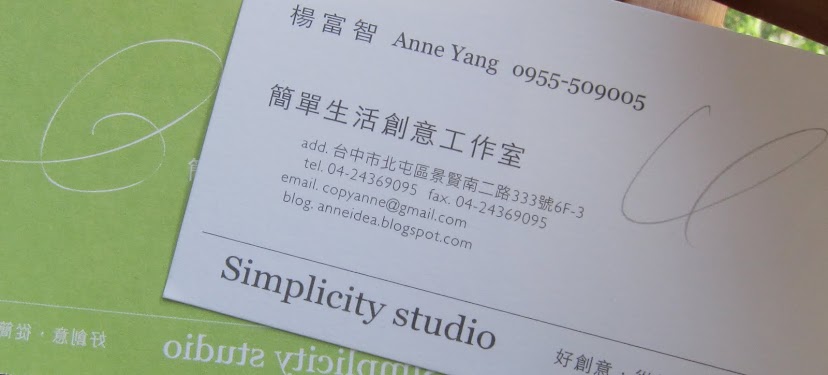
簡單生活創意工作室
Simplicity Studio